As I've admitted, I am an avid collector of baseball cards, and although I have some idea, I've never actually seen a card go through the process of being selected and laid out. I'm a big fan of the photo that Simmons selected for Manny Ramirez's '08 card. Whether or not the folks at UD will trump his decision and put out a different photo remains to be seen.
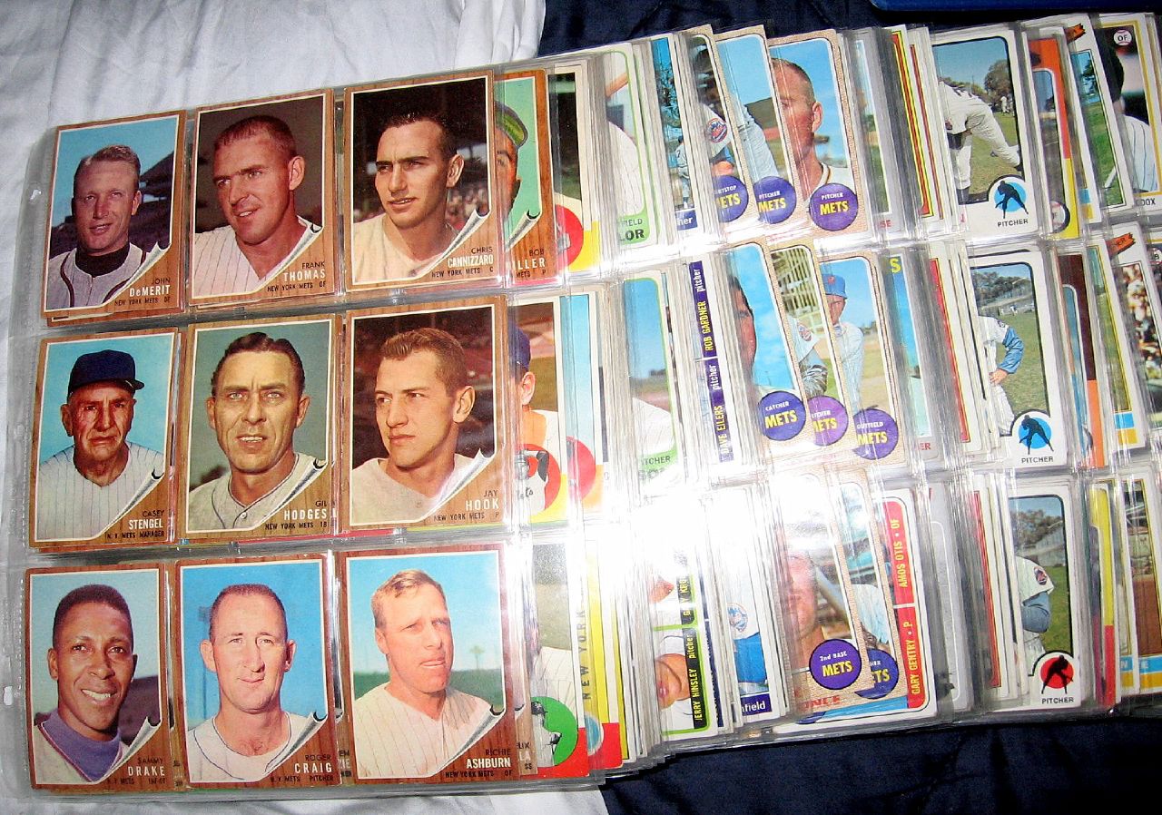
But it got me to thinking about which photos are used on particular baseball cards. As I've said, I've been collecting for about 20 years, and my collection spans back even further than that. Similar to "The Holy Book,"spoken about last week by Greg at Faith and Fear, I have amassed my own collection of Mets cards. Though not nearly as comprehensive, my collection includes pretty much every regular-issue Topps Mets card (less 4, Seaver's rookie, Ryan's rookie and Ryan's 1970 out of my price range, 1967 Don Cardwell simply too elusive) going back to 1962, kept neatly in albums. The remaining cards, compiled from other, lesser-known Topps issues (Stadium Club, Finest, Gallery for example), and those from other companies (Upper Deck, Donruss, Fleer, et al) are sleeved and boxed in similar order for easy access.
 So, where am I going with all this? Well, what I picked up from watching the Simmons clip, plus examining the contents of my own collection, I've come to the conclusion that while Topps is the standard, having built a history and tradition almost 40 years older than Upper Deck, it's become clear that Upper Deck seems to take much greater care in producing an eye-popping product. Let's examine, for example, the 2007 cards featuring Endy Chavez.
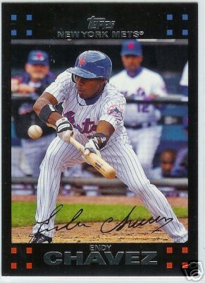
 Here's Topps' offering for Endy. Topps designers seem to be ripping off the Donruss designs from the late 1980s, where I think they just got a bunch of children together and had them throw some paint at a wall. Donruss always had this feel of being the snob's baseball card, like somehow their fancy design was better than the working man's Topps. Even that name, Donruss, sounded strange. But I digress. It's a nice, charming little design and a good, crisp photo of Endy, in full form, laying down another drag bunt for a base hit. It's nice on many levels, even as an educational device (see kids, here's how you lay down the perfect drag bunt)...
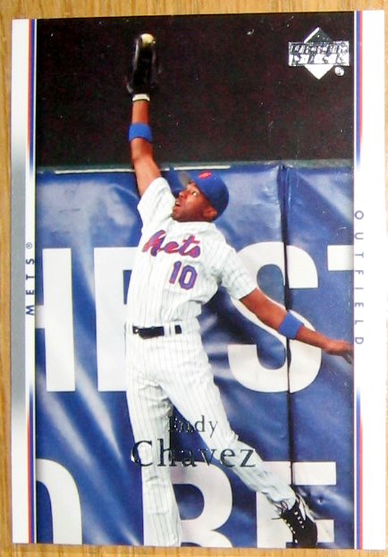
 ...But it's got nothing on the UD card. When you think of Endy Chavez, this is what you think of. Endy, flying through the air last October, ready to jump out of that card and right into your lap to snowcone the sure HR at the wall. This is the kind of photo that was made for a baseball card. But Topps barely gave this any thought, only chopping it down and slapping it onto half of a card in their 2006 Update series (on top of Ugly Molina no less!).
The only way that card could have been better is if they used the wide-angle shot. But then again, that would likely have been misconstrued as an advertisement for life insurance.
I know Topps has their own photographers, and, unlike Upper Deck, they sign each player to individual contracts, as opposed to simply making an agreement with the Player's Union (this the reason why Topps can claim exclusivity to Barry Bonds), and I don't know how Upper Deck procures their photographs, but it has become glaringly obvious over the past few years that UD has been working from a better pool of photographs for their cards, and photos more representative of a specific moment that you remember the player for, as opposed to a generic action shot or something posed and/or airbrushed (a Topps trademark).
No comments:
Post a Comment